Did you know SurveyGizmo has 42 different question types? Depending on which question you decide to use to collect data in your survey, you may get a different default chart/reporting element within the Standard Report.
Below, we will outline the default chart/reporting element for each SurveyGizmo question type. In many cases, you can convert the default chart/reporting element into another compatible type. Feel free to visit the the linked tutorial for each question and reporting element.
If you want more information about our questions and the best use-case for each, visit our Question Types Guide.
Basic Question Types

- Check it out in an example report!
- Add a survey with this question to your account!
Radio Button
Radio Button questions allow respondents to select a single choice from a list.
How does it report?
Radio Button questions report as a Pie Chart along with a Summary Table below the chart. Each slice of the pie represents one answer option in the question.
Other compatible charts for Radio Buttons are: Arc, Donut, Vertical Bar, Stacked Vertical Bar, Horizontal Bar, Stacked Horizontal Bar, and Spiderweb.
Learn more about the Pie Chart and how you can customize it by visiting our Pie Chart help article.
- Check it out in an example report!
- Add a survey with this question to your account!
Radio Button Grid
A Radio Button Grid allows respondents to select one answer option (column) for each row in a grid.
How does it report?
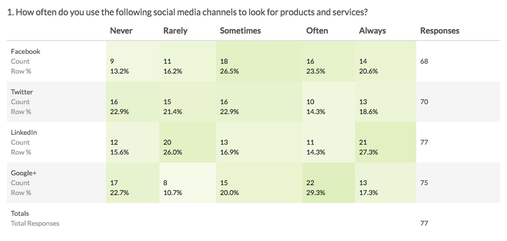
Radio Button Grids report as a Grid by default. Each row and column combination will have a count and row percent. The total Responses for each row will also display in the grid by default.
There are no other reporting elements to report all of the Radio Button Grid data. However, you can report on each grid row separately using any chart compatible with a Radio Button question.
Learn more about the Grid reporting element via the Standard Report: Grid Tutorial.
- Check it out in an example report!
- Add a survey with this question to your account!
Dropdown Menu
Dropdown Menus are single-select questions with answer options displayed in a dropdown list. We also have the ability to create a multi-select Dropdown Menu.
How does it report?
Dropdown Menus report as a Pie Chart, by default, with a table that includes a count and percent for each answer option.
Other compatible charts for Radio Buttons are: Arc, Donut, Vertical Bar, Stacked Vertical Bar, Horizontal Bar, Stacked Horizontal Bar, and Spiderweb.
Learn more about the Pie Chart and how you can customize it by visiting our Pie Chart Tutorial.
- Check it out in an example report!
- Add a survey with this question to your account!
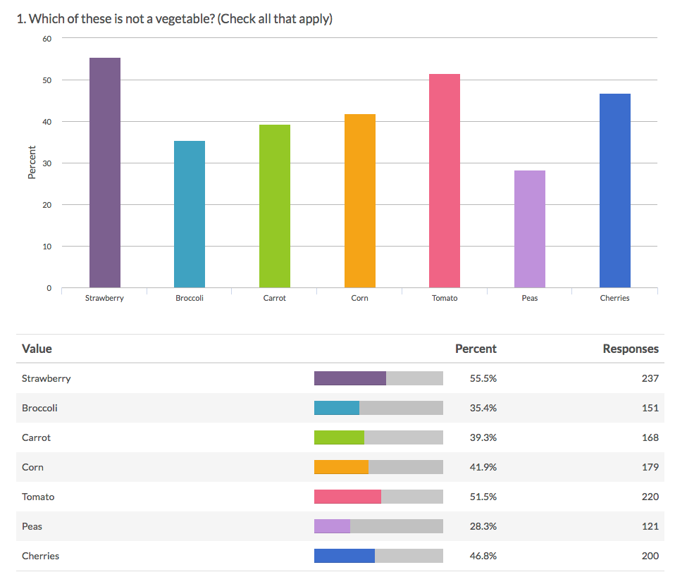
Checkboxes
Checkbox questions allow your respondents to select multiple answers from a list.
How does it report?
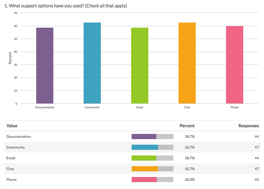
Checkbox questions report as a Vertical Bar Chart, by default, with a table that includes a count and a percent for each answer option. These percentages will not add up to 100% as respondents can choose more than one option.
Other compatible charts for Checkboxes are: Stacked Vertical Bar, Horizontal Bar, and Stacked Horizontal Bar.
Learn more about the Vertical Bar Chart and how you can customize it by visiting our Vertical Bar Chart help article.
- Check it out in an example report!
- Add a survey with this question to your account!
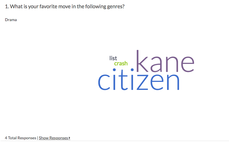
Textboxes
A Textbox question is a short-answer, open-text field.
How does it report?
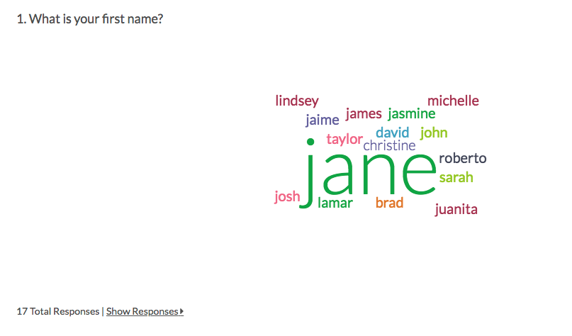
Textbox questions report as a Word Cloud along with a Collapsed Response List.
There are no other reporting elements compatible with Textbox questions. However, you can remove the Word Cloud and can also expand the list of individual text entries, if needed.
Learn more about the Textbox reporting options via the Word Cloud and Collapsed Response List tutorials.

- Check it out in an example report!
- Add a survey with this question to your account!
Essay / Long Answer
An Essay question is an open-text field used to gather longer open-text responses.
When to use it
Essay / Long Answer questions report as a Word Cloud along with a Collapsed Response List.
There are no other reporting elements compatible with Essay / Long Answer questions. However, you can remove the Word Cloud and can also expand the list of individual text entries, if needed.
Learn more about the Essay / Long Answer reporting options via the Word Cloud and Collapsed Response List tutorials. Also, consider the Open Text Analysis tool to review and categorize your open-ended data.
- Check it out in an example report! Password: example
- Add a survey with this question to your account!
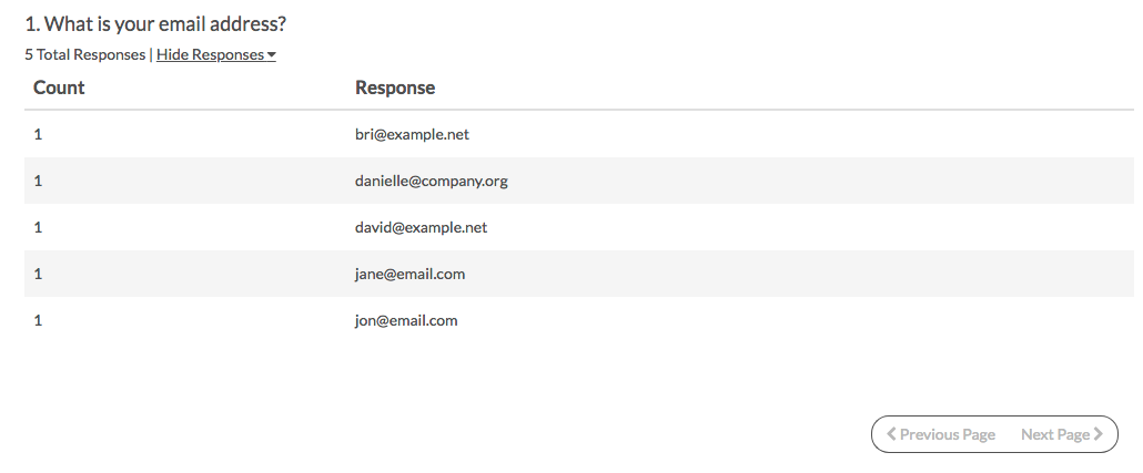
An Email question is a short-answer, open-text field with validation that ensures entries are email addresses.
How does it report?
Email questions report as a Collapsed Response List. There are no other compatible reporting elements for the Email question. However, a setting allows the list to be expanded by default to show each individual email entry.
Personally Identifiable Information (PII) (like email addresses or contact forms) is automatically excluded from publicly shared reports unless they are password protected. Learn more about your report sharing options when using a Contact Form question.
Learn more about this reporting element in the Collapsed Response List Tutorial.
- Check it out in an example report!
- Add a survey with this question to your account!
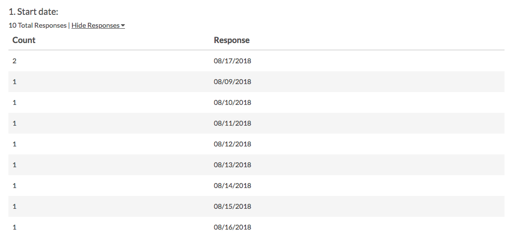
Date
A Date question is a short-answer, open-text field with validation that ensures entries are dates. You can choose to validate using the following formats:
- MM/DD/YYYY
- DD/MM/YYYY
- YYYY/MM/DD
How does it report?
Date questions report as a Collapsed Response List. There are no other compatible reporting elements for the Date question. However, a setting allows the list to be expanded by default to show each individual date entry.
Learn more about this reporting element in the Collapsed Response List Tutorial.
Intermediate Question Types
- Check it out in an example report!
- Add a survey with this question to your account!
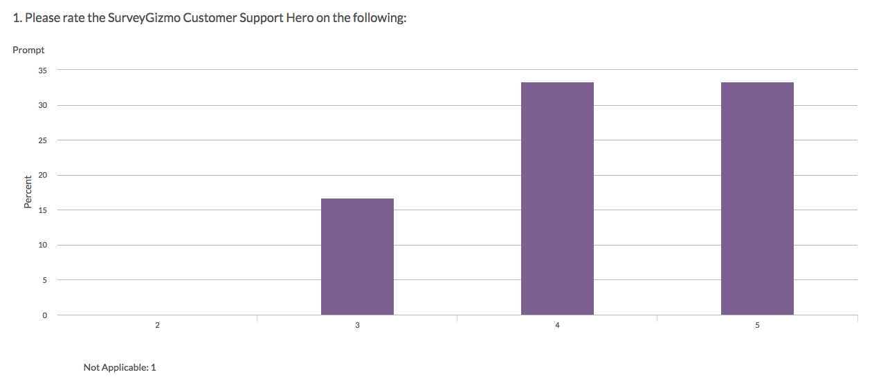
Slider
The Slider is an interactive question that allows respondents to select values from a continuous range by dragging a slider along a range.
Use a Slider List to gather feedback on multi items.
How does it report?
In the Standard Report, Single Sliders report as a Histogram. A count of respondents who selected Not Applicable will display below the chart.
Other compatible charts for Slider questions are: Pie, Arc, Vertical Bar, Horizontal Bar, Line, Spline, Area, Area Spline, and Scatter Plot.
Learn more about the Histogram and how you can customize it by visiting our Histogram help article.
- Check it out in an example report!
- Add a survey with this question to your account!
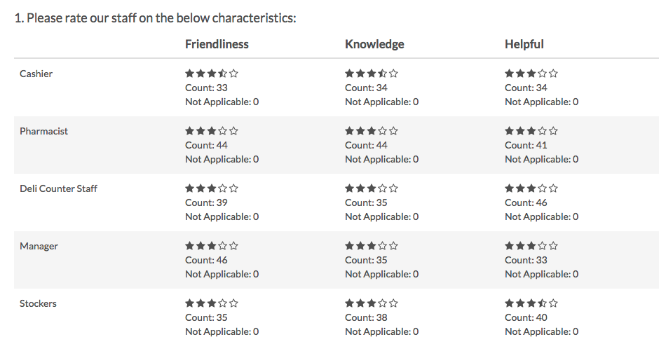
Star Rating Grid
Star Rating Grid questions allow respondents to use stars to rate multiple items (rows) on multiple dimensions (columns). Each star represents the equivalent numeric value for that rating (e.g. Four stars will report a 4).
How does it report?
Star Rating Grid questions report as a Table with summary statistics. Count will be available by default, whereas Min, Max, Average, and Standard Deviation can be included via Layout & Options. No other reporting elements are available for the Star Rating Grid.
Learn more about this question type and the licenses in which it is available in the Star Rating Grid Question Type Tutorial.
- Check it out in an example report!
- Add a survey with this question to your account!
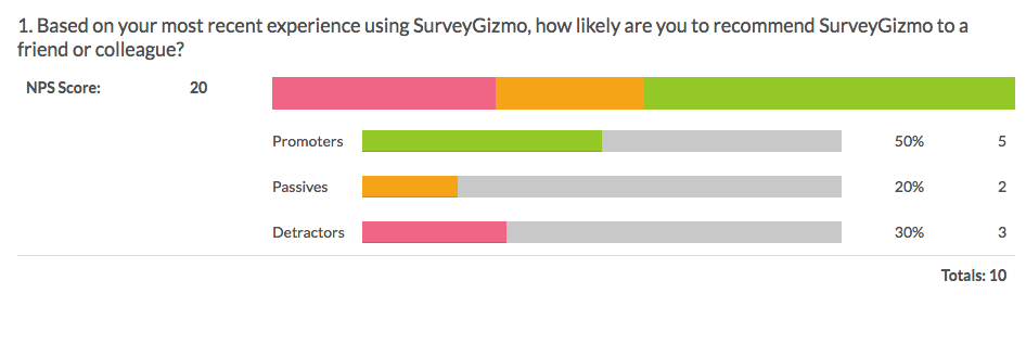
Net Promoter Score® (NPS)
Net Promoter Score measures the loyalty between a provider and consumers.
NPS questions are typically phrased like so: "Based on your experience, how likely are you to recommend SurveyGizmo to a friend or colleague?"
Respondents respond on a scale from 0 to 10. Typically, the reporting value is numeric for analysis purposes.
How does it report?
NPS questions report as an NPS Chart. In reports responses are categorized as either Promoters (9-10), Neutrals (7-8) or Detractors (0-6). A Net Promoter Score is calculated as the percent of promoters minus the percent of detractors. You can also report on an NPS question via a Table Report Element, if you simply want a breakdown of how many respondents selected each of the options (0-10).
Learn more about the NPS Chart in the NPS Chart Tutorial.

- Add a survey with this question to your account!
File Upload
The File Upload question type allows you to have your respondents upload up to 10 files/documents as part of their survey response. You can choose the file extensions you wish to allow as well as a max upload size when you create the question.
How does it report?
File Upload questions report the count of uploaded files. To access the specific respondent uploaded files, create a Bulk File Export.
- Check it out in an example report!
- Add a survey with this question to your account!
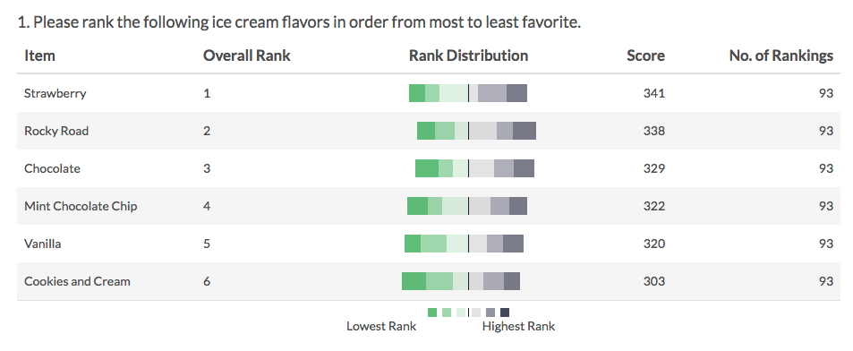
Drag & Drop Ranking
Drag & Drop Ranking questions allow respondents to rank a list of items by dragging and dropping each item in order of preference.
While we provide screen reader messages for this question, it is not easily accessible for respondents using screen readers.
How does it report?
In the Standard Report Drag & Drop Ranking questions report as a Diverging Stacked Bar Chart. The table will include a row for each item in your Drag & Drop Ranking question. Each item will show a Rank, Distribution, Score, and No. of Rankings. The Drag & Drop Ranking question is not compatible with any other reporting elements.
Learn more about the Diverging Stacked Bar Chart, by visiting our help article. If you're curious about how the rank score is calculated, we break it down here.
- Check it out in an example report!
- Add a survey with this question to your account!
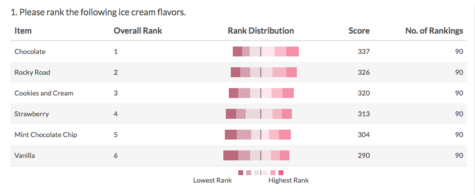
Ranking Grid
Ranking Grid questions allow respondents to rank a list of items in order, by selecting their numeric rank from a table of radio buttons, where each column is restricted to a single answer across all rows. This question type is designed as a numeric ranking, so you will not be able to put text into the column headers.
How does it report?
In the Ranking Grid questions report as a Diverging Stacked Bar Chart. The table will include a row for each item in your Drag & Drop Ranking question. Each item will show a Rank, Distribution, Score, and No. of Rankings. The Ranking Grid question is not compatible with any other reporting elements.
Learn more about the Diverging Stacked Bar Chart, by visiting our help article. If you're curious about how the rank score is calculated, we break it down here.
- Check it out in an example report!
- Add a survey with this question to your account!
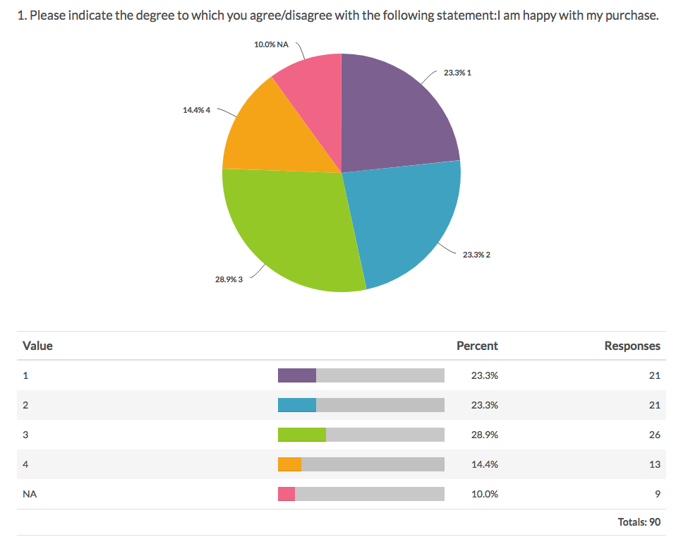
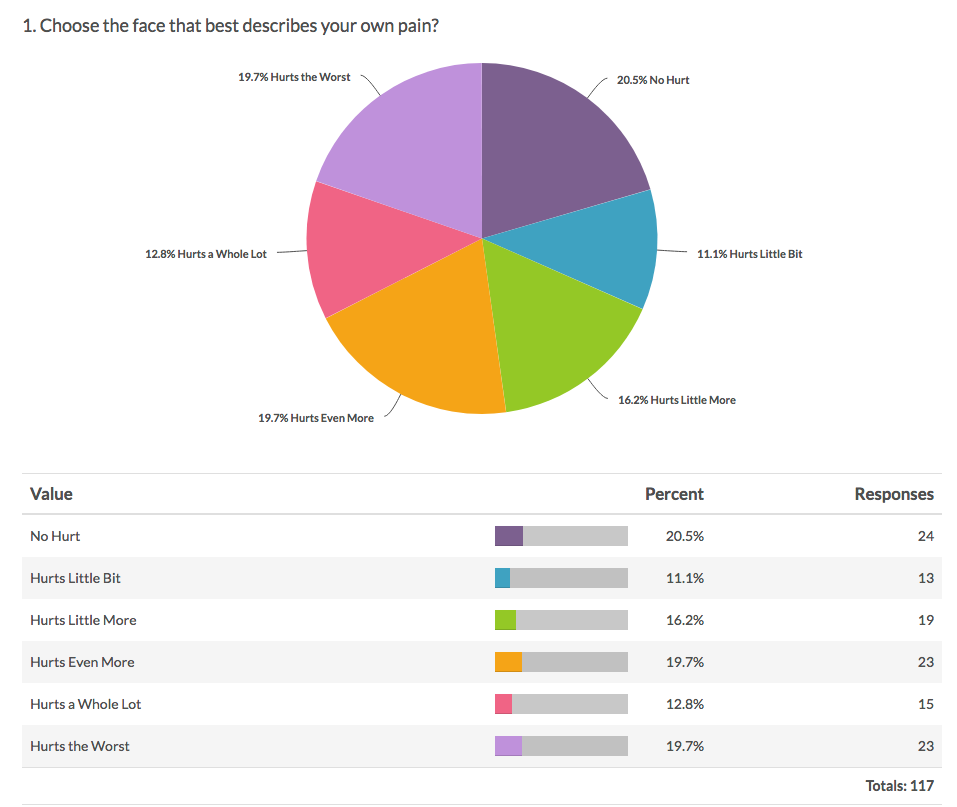
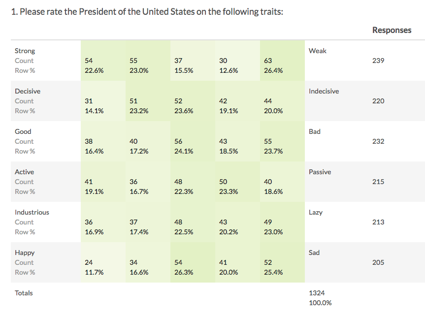
Rating (Likert Scale)
A Rating question is a single-select scale question, often referred to as a Likert Scale.
How does it report?
Rating (Likert Scale) questions report as a Pie Chart with a summary table that includes a count and percent for each answer option.. Each slice of the pie represents one answer option in the question.
Other compatible charts for Rating (Likert Scale) questions are: Arc, Donut, Vertical Bar, Stacked Vertical Bar, Horizontal Bar, Stacked Horizontal Bar, and Spiderweb.
Learn more about the Pie Chart and how you can customize it by visiting our Pie Chart help article.
- Check it out in an example report!
- Add a survey with this question to your account!
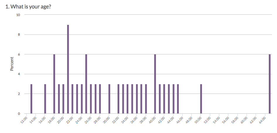
Number
A Number question is a short-answer, open-text field with validation that ensures entries are numbers.
How does it report?
The Number question reports as a Histogram. Other compatible reporting elements are: Pie Chart, Arc, Vertical Bar, Line, Spline, Area, Area Spline, and Scatter Plot.
Learn more about the Histogram reporting element in the Histogram Tutorial.
- Check it out in an example report!
- Add a survey with this question to your account!
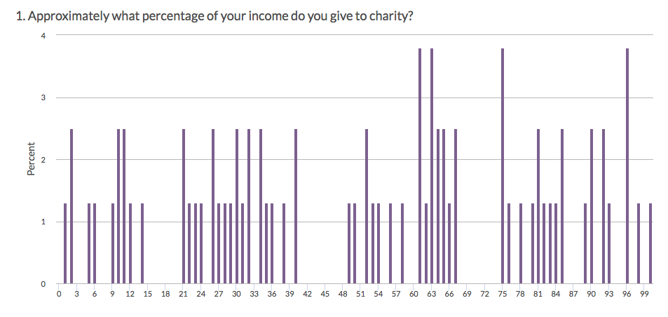
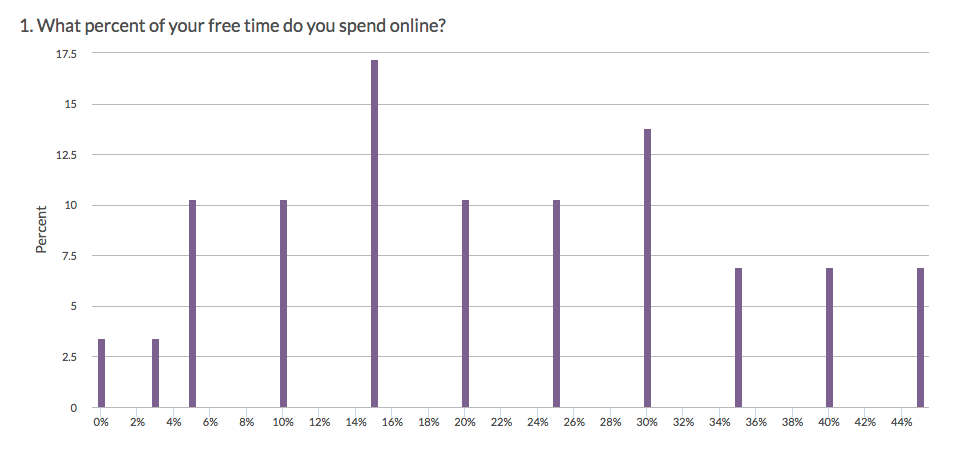
Percent
A Percent question is a short-answer, open-text field with validation that ensures entries are percentages.
To allow respondents to enter percentages for a list of items that are then summed for a total value check out our Continuous Sum Question Type.
How does it report?
The Percent question reports as a Histogram. Other compatible reporting elements are: Pie Chart, Arc, Vertical Bar, Line, Spline, Area, Area Spline, and Scatter Plot.
Learn more about the Histogram reporting element in the Histogram Tutorial.
- Check it out in an example report!
- Add a survey with this question to your account!
Image Select (select one)
The Image Select (select one) question type is a single-select question with clickable images as answer options.
How does it report?
Image Select (select one) questions report as a Pie Chart along with a Summary Table below the chart. Each slice of the pie represents one image (answer option) in the question. The Pie Chart and corresponding Summary Table will include the Option Titles rather than the images.
Other compatible charts for Image Select (select one) questions are: Arc, Donut, Vertical Bar, Stacked Vertical Bar, Horizontal Bar, and Stacked Horizontal Bar.
Learn more about the Pie Chart and how you can customize it by visiting our Pie Chart help article.
- Check it out in an example report!
- Add a survey with this question to your account!
Image Select (multi select)
The Image Select (multi select) question type displays multiple images to the respondent allowing them to select their answer by clicking directly on the images. Respondents are able to select multiple images.
How does it report?
Image Select (multi select) questions report as a Vertical Bar Chart, by default, with a table that includes a count and a percent for each answer option. These percentages will not add up to 100% as respondents can choose more than one option.
The Vertical Bar Chart and corresponding Summary Table will include the Option Titles rather than the images.
Other compatible charts for Image Select (multi select) are: Stacked Vertical Bar, Horizontal Bar, and Stacked Horizontal Bar.
Learn more about the Vertical Bar Chart and how you can customize it by visiting our Vertical Bar Chart help article.
- Check it out in an example report!
- Add a survey with this question to your account!
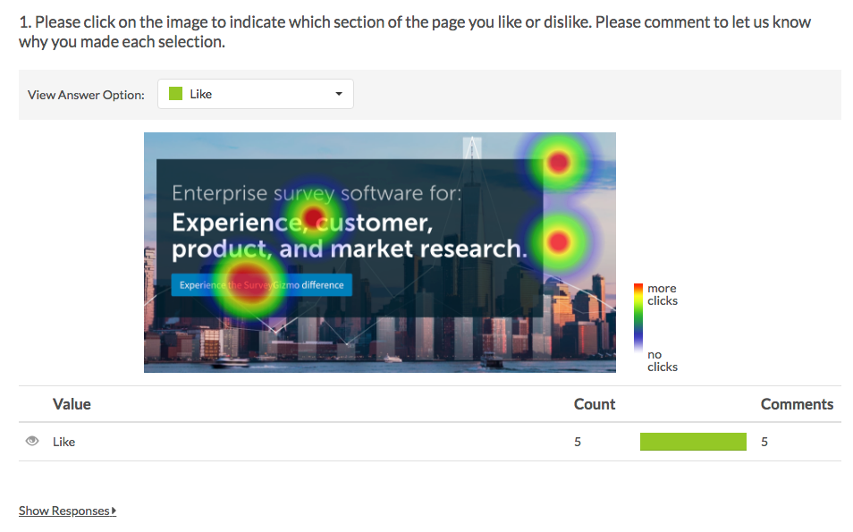
Image Heatmap
The Image Heatmap question type allows your survey respondents to provide feedback on an image. Respondents can click anywhere on that image and select answer options you provide e.g. Like, Dislike.
You can also allow respondents to comment on their selections to provide additional context.
How does it report?
The Image Heatmap question reports as a Heatmap Element showing aggregated data of your respondents' clicks plotted across your image. The areas of your image with a high density of respondent clicks will be indicated by color intensity (the more red the color, the more respondents have clicked on that area relative to other areas of the image).
Learn more about this Standard Report element and the available customizations via the Image Heatmap Tutorial.
- Check it out in an example report!
- Add a survey with this question to your account!
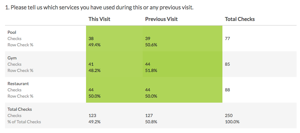
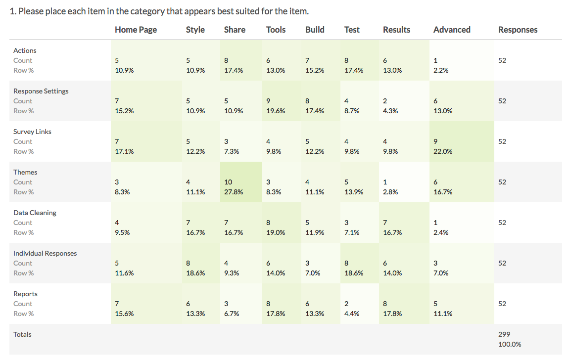
Checkbox Grid
The Checkbox Grid allows respondents to select multiple answer options (columns) for each row in a table.
How does it report?
Checkbox Grids report as a Grid by default. Each row and column combination will have a count and row percent. The total Responses for each row will also display in the table by default. There are a number of statistics available for this element; visit our tutorial to see how these are calculated.
There are no other reporting elements to report all of the Checkbox Grid data. However, you can report on each grid row separately using any chart compatible with a stand-alone Checkbox question.
Learn more about the Grid reporting element via the Standard Report: Grid Tutorial.
- Check it out in an example report!
- Add a survey with this question to your account!
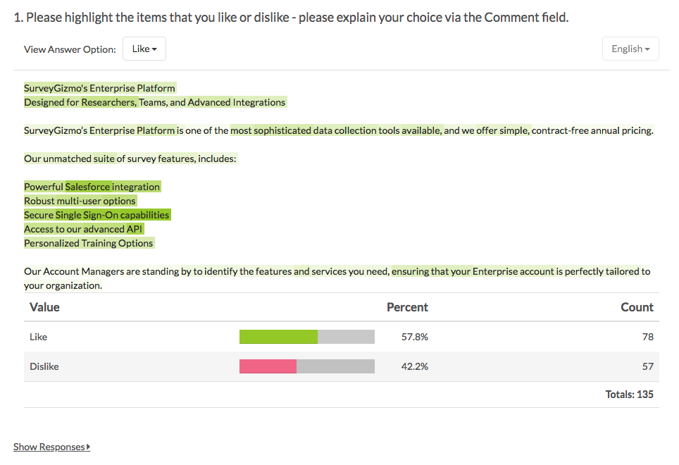
Text Highlighter
The Text Highlighter question type allows your survey respondents to provide feedback on a paragraph or two of text. Respondents can click specific pieces of the text sample and select answer options you provide e.g. Like, Dislike.
You can also allow respondents to comment on their selections to provide additional context.
How does it report?
The Text Highlighter question reports as a Heatmap Element showing aggregated data of your respondents' highlights. The areas of your text sample with a high density of respondent highlights will be indicated by color intensity (the darker the color, the more respondents have highlighted that area relative to other areas of the text sample).
Learn more about this Standard Report element and the available customizations via the Text Highlighter Tutorial.

- Check it out in an example report!
- Add a survey with this question to your account!
Signature
The Signature question type allows your survey respondents to add their signature using their mouse or touch screen. The Signature question includes both a field for respondents to sign, as well as, a textbox to type their full name.
How does it report?
Standard Reports will include a count of the signatures received. To view both the signature and the typed name, visit your survey's Individual Responses tab. You can also view the typed names by exporting your survey's raw data via the Raw Data Export.
- Check it out in an example report!
- Add a survey with this question to your account!
Dropdown Menu List
Dropdown Menu List questions allow respondents to select an option for multiple items in a list using a uniform dropdown of answers.
How does it report?
Dropdown Menu Lists report as a Grid by default. Each row in the report will represent a row in the question, whereas each column in the report will represent an answer option within the dropdown menu. The total Responses for each row will also display in the table by default.
There are no other reporting elements to report all of the Dropdown Menu List data. However, you can report on each grid row separately using any chart compatible with a stand-alone Dropdown Menu question.
Learn more about the Grid reporting element via the Standard Report: Grid Tutorial.
- Check it out in an example report!
- Add a survey with this question to your account!
Textbox List
A Textbox List is a list of short-answer, open-text fields with labels for each row.
You can define the textbox width and choose to position the labels on the left or right side of the input field.
How does it report?
In the Standard Report, Textbox List questions include a Word Cloud for each row in the question. Below each word cloud is a Collapsed Response List of all unique responses for that row.
Visit our help articles to learn more about Word Clouds and Collapsed Response Lists.
Advanced Question Types
- Check it out in an example report!
- Add a survey with this question to your account!
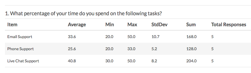
Continuous Sum
Continuous Sum questions allow respondents to enter numeric values (often percentages or dollar amounts) for a list of items that are then summed for a total value.
How does it report?
Continuous Sum questions report as a Table. The table displays the following statistics for each item: average, minimum, maximum, standard deviation, sum, and total responses. Learn more about this question by visiting the Continuous Sum tutorial.
- Check it out in an example report!
- Add a survey with this question to your account!
Slider List
The Slider List is an interactive question that allows respondents to select values for multiple rows of items by dragging a slider along a range.
If you want to use a slider to rate a single item, check out our Slider question type.
How does it report?
In the Standard Report, each list item will report as a separate Vertical Bar Chart. A count of respondents who selected Not Applicable will display below the chart.
Visit the Vertical Bar Chart Tutorial to learn about your customization options for this reporting element.
- Check it out in an example report!
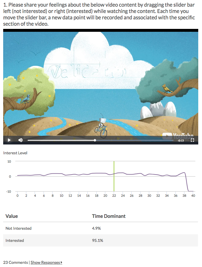
Video Sentiment
The Video Sentiment question type allows your survey respondents to provide continuous feedback while watching a video, by dragging a slider along a range.
If you would like to gather continuous feedback for audio media instead, use the Video Sentiment question type.
How does it report?
In the Standard Report, the Video Sentiment question reports as a Spline Chart (one chart for each report label) in conjunction with the video element. The Spline Chart represents the average sentiment across all respondents (y-axis) for each second of the video (x-axis). The y-axis values will range from -10 (left label) to 10 (right label).
The Time Dominant data reflects the amount of time (as a percentage) that the slider was shifted to one value (label) or the other.
You can play the video within the report and will see the video track across the sentiment chart via a vertical green line. While playing, you can click along the chart to see the corresponding location in the video.
If you have enabled comments for your Video Sentiment question, any comments provided by your respondents will be available as part of the report element. Each comment will be time-stamped based on the point in the video when the comment was submitted. Click Show Responses to view the specific comments.
- Check it out in an example report!
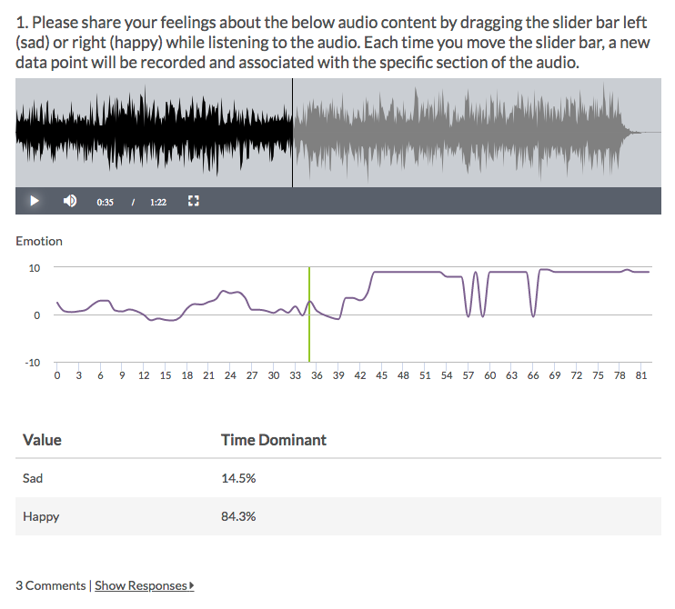
Audio Sentiment
The Audio Sentiment Question Type allows your survey respondents to provide continuous feedback while listening to audio, by dragging a slider along a range.
If you would like to gather continuous feedback for video media instead, use the Video Sentiment question type.
How does it report?
In the Standard Report, the Audio Sentiment question reports as a Spline Chart (one chart for each report label) in conjunction with the audio player. The Spline Chart represents the average sentiment across all respondents (y-axis) for each second of the audio (x-axis). The y-axis values will range from -10 (left label) to 10 (right label).
The Time Dominant data reflects the amount of time (as a percentage) that the slider was shifted to one label or the other.
Click directly on any section of the Spline Chart to see the corresponding location in the audio. You can play the audio within the report and will see the audio track across the chart via a vertical green line.
If you have enabled comments for your Audio Sentiment question, any comments provided by your respondents will be available as part of the report element. Each comment will be time-stamped based on the point in the audio when the comment was submitted. Click Show Responses to view the specific comments.
- Check it out in an example report!
- Add a survey with this question to your account!
Cascading Dropdown Menu
The Cascading Dropdown Menu allows you to drill down through hierarchical data by using one dropdown menu as a filter into the next.
For example, a common use is the collection of the respondent's state and city. Using this question type, the respondent's state selection can be used to filter the options in the city dropdown.
How does it report?
In the Standard Report, Cascading Dropdown Menu questions display as a Pie Chart.
The first/highest level of the dropdown will be displayed initially. You can click on the slices of the pie to show the next level of data associated with that slice.
Below the chart, you will see a row for each unique combination of your dropdown menus with count and percent statistics.
")
- Check it out in an example report!
Conjoint (Choice-Based)
Conjoint is a market research question used to determine how customers value the various features that make up an individual product or service. Use the Conjoint question to determine what combination of features is most influential in customer decision making.
How does it report?
There are two elements included in the Standard Report for the Conjoint question.
The Part-Worth Utilities bar chart shows the importance of individual attribute levels based on their part-worth utilities. A utility is a measure of relative desirability or worth. The higher the utility, the more desirable the attribute level. Levels that have high utilities have a large positive impact on influencing respondents to choose products.
Below the Part-Worth Utilities bar chart is an Attribute Stats table for all Attributes and their Levels. Each Level will have a Utility. Each Attribute will have a Relative Importance percentage. All Relative Importance percentages will add up to 100%. Think of Relative Importance as the influence the attribute has on product decision making.There
- Check it out in an example report!
- Add a survey with this question to your account!
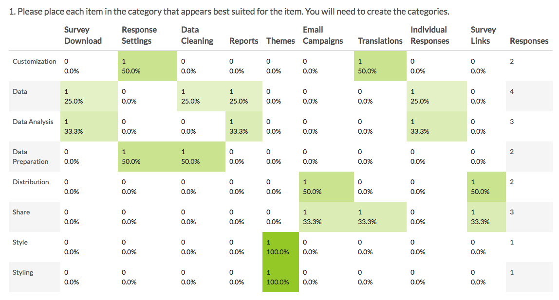
Grouping (Open Card Sort)
The Grouping (Card Sort) question type is interactive and allows respondents to categorize options by clicking and dragging Items into Groups of their choosing.
How does it report?
Grouping (Open Card Sort) questions report as a Grid with a count and frequency for each Item and Group combination. The Groups created by your survey respondents are the row headers and the Items you provided for respondents to sort are the columns.
There are no other reporting elements to report all of the Grouping (Closed Card Sort) data. Visit the Standard Report: Grid Tutorial to learn more.
- Check it out in an example report!
- Add a survey with this question to your account!
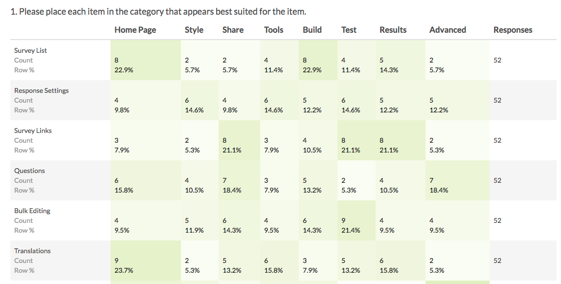
Grouping (Closed Card Sort)
The Grouping (Card Sort) question type allows respondents to categorize options by clicking and dragging Items into Groups. In the Closed version of this question, the options and categories are determined by you as the survey builder.
How does it report?
Grouping (Closed Card Sort) questions report as a Grid with a count and frequency for each Item and Group combination.
There are no other reporting elements to report all of the Grouping (Closed Card Sort) data. However, you can report on each grid row separately using any chart compatible with a Radio Button question.
Learn more about the Grid reporting element via the Standard Report: Grid Tutorial.
- Check it out in an example report!
- Add a survey with this question to your account!
Quick Sort
The Quick Sort question type is interactive and allows respondents to categorize options by clicking and dragging Items into Groups of your choosing.
Once a respondent places an item into a group, the item is no longer visible and thus cannot be moved from one group to another.
How does it report?
Quick Sort questions report as a Grid with a count and frequency for each Item and Group combination.
There are no other reporting elements to report all of the Grouping (Closed Card Sort) data. However, you can report on each grid row separately using any chart compatible with a Radio Button question.
Learn more about the Grid reporting element via the Standard Report: Grid Tutorial.
- Check it out in an example report!
- Add a survey with this question to your account!
Dropdown Menu Grid
The Dropdown Menu Grid allows respondents to select an option for each column and row combination using a uniform dropdown of answers.
How does it report?
Dropdown Menu Grids report as a series of Grids, one for each row header in the question. The count and percent for each column and answer option combination will be shown.
- Check it out in an example report!
- Add a survey with this question to your account!
Textbox Grid
The Textbox Grid allows respondents to enter short open-ended text answers to multiple questions in a table format. Each 'cell' in the table is a textbox.
How does it report?
The Textbox Grid reports as a Grid with a count and percentage displaying the number of times someone answered each particular cell in the table.
To look at the specific text responses, you can create a CSV/Excel export or take a look at the Individual Responses.
You can also report on each grid row separately using the Insert tool available in the Standard Report. This option will add a Word Cloud element for each column in a given grid row.
- Check it out in an example report!
- Add a survey with this question to your account!
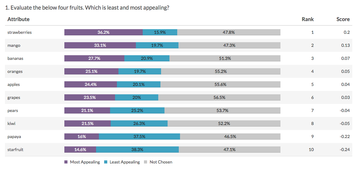
Max Diff
Using the Max Diff question type (aka maximum difference scaling) respondents are shown a set of the possible attributes and are asked to indicate the best and worst attributes (or most and least important, most and least appealing, etc.).
How does it report?
For each attribute, you will see the percentage of times it was ranked as most appealing, least appealing, or not chosen.
The attributes will be ranked based on the score which is computed using the below formula:
# times attribute was selected as best - # times attribute was selected as worst
____________________________________________________________________________
# times the item appeared
From the score we can determine a couple of things:
- The higher the score, the more the feature is appealing to respondents.
- A positive score means that that attribute was selected as MOST appealing more often than least appealing.
- A negative score means that that attribute was chosen as LEAST appealing more often than most appealing.
- A score of zero means that that attribute was chosen as MOST and LEAST appealing an equal number of times OR it has never been chosen as most and least appealing.
- If a score of an item is two times bigger than another item, it can be interpreted that it is twice as appealing.
Learn more about this question type and the licenses in which it is available in the Max Diff Question Type Tutorial.
- Check it out in an example report!
- Add a survey with this question to your account!
Semantic Diff
Semantic Differential questions are a form of rating scale designed to identify the connotative meaning of objects, words, and concepts.
How does it report?
Semantic Differential questions report as a Grid, with values and percentages for each option selected. The left and right row headers from the question will be displayed in the report for reference.
Learn more about the Grid reporting element via the Standard Report: Grid Tutorial.
- Check it out in an example report! Password: example
- Add a survey with this question to your account!
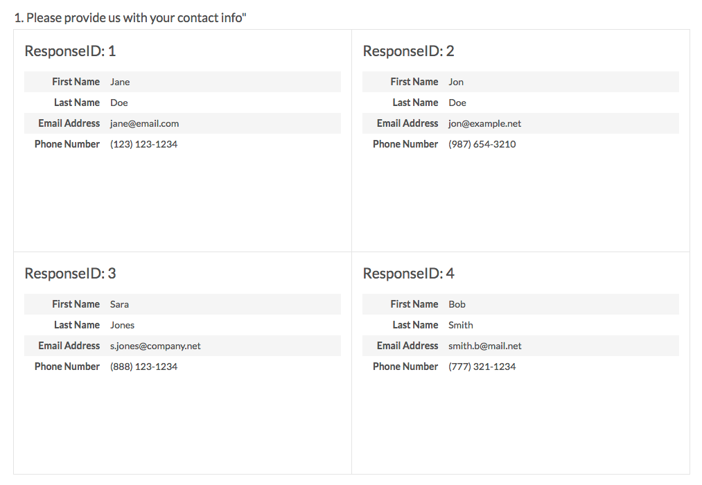
Contact Form
The Contact Form question type is a formatted group of textboxes designed to collect contact information.
How does it report?
In the Standard Report your Contact Form data will report in Contact Cards which you can page through to review.
Personally Identifiable Information (PII) (like email addresses or contact forms) is automatically excluded from publicly shared reports unless they are password protected. Learn more about your report sharing options when using a Contact Form question.
Visit the Standard Report: Contact Cards Tutorial for additional information.
- Check it out in an example report!
- Add a survey with this question to your account!
Custom Group
The Custom Group question type allows you to group questions of different types together and control the layout of the questions, specifically whether there is a line break and the next question displays on the same line.
How does it report?
Custom Groups report each subquestion in order. Each element will be treated as its own question within the report.
Check out the corresponding question type tutorials for each subquestion in your Custom Group to see how it will report. For example, if a subquestion in your Custom Group is a Radio Button question, it will report as a Pie Chart. Consider the DIY Grid (pictured) as an option for grouping and reporting on Custom Group data.

- Check it out in an example report!
- Add a survey with this question to your account!
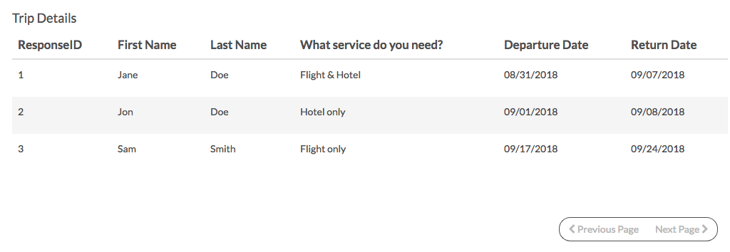
Custom Table
The Custom Table question type allows you to arrange and repeat questions of different types in a table format.
Question types that can be added as columns are:
- Radio Buttons
- Dropdown Menus
- Checkboxes
- Textboxes
- Essays
How does it report?
Custom Tables report as a single element with each subquestion grouped by row (by default). You do have the option to group the subquestions by column instead.
Check out the corresponding question type tutorial for each subquestion in your Custom Table to see how the subquestion will report.
Learn about this and other Custom Table reporting options by visiting the Custom Tables and the Standard Report Tutorial.
User Data
If you are using User Data Fields to store data about each of your SurveyGizmo users, you can leverage this data within surveys using the User Data question.
As an example, let's say that we've set up training course instructors as users in our SurveyGizmo account. Within their User Data Fields, we store information about the course each user teaches. We can leverage this data to create a survey question. Respondents can then select the course that they took, which then maps back to the instructor data allowing you to share individualized reports.
How does it report?
If you selected the option to Restrict users to only view responses that are related to their User Data when setting up your User Data question, reports will be automatically filtered such that users will only see data that matches their user data values. Account administrators will always see all data, regardless of the values in their User Data Fields.
If the Restrict users to only view responses that are related to their User Data option was not selected, the data will report like any other question.
For additional information on how the User Data question reports, visit the User Data Question Type Tutorial.
Additional Reporting Elements
In addition to the above default reporting elements, SurveyGizmo offers a number of other charts that the defaults can be converted to. View a list of all charts and reporting elements here.
Non-Question Reporting Elements
Aside from reporting on data gathered via survey questions, the Standard Report allows you to add:
- Text and/or Images - add instructions or images to your report
- Response Map - see where in the world your responses are coming from
- Response Table - view your Individual Responses inside of your Standard Report
- Response Timeline - see how many responses you have gathered over time
- Response Counts - view a completion percentage as well as the number of responses by status (Complete, Partial, and Disqualified)
- Email Campaign Statistics - add delivery and responses statistics related to your Email Campaign messages
- Quotes - add quotes directly from open-ended responses
- URL, SSO, and Hidden Values - add data stored behind the scenes
- Email Invite and Contact Fields - include data that was uploaded as part of an Email Campaign contact list
- Crosstab - add a Crosstab report within your Standard Report
- Longitudinal Reporting - see how your data has changed overtime
- Device Chart - see a charted breakdown of the types of devices that are being used to take your survey
- Sentiment - include sentiment analysis data in your Standard Report
Net Promoter, Net Promoter System, Net Promoter Score, NPS and the NPS-related emoticons are registered trademarks of Bain & Company, Inc., Fred Reichheld and Satmetrix Systems, Inc.
Admin
— Mike Cordeiro on 06/15/2020
@Eric: Thank you for reaching out to our Help page!
Regrettably there is not currently a way to have the application automatically shift to different charts for specific question types. The charts must be changed manually each time one would like to view data for a particular question type.
Sincere apologies!
Mike
Technical Writer
SurveyGizmo Learning and Development
— Eric on 06/15/2020
Is there a way to change the default chart type associated with a question type? For example, is there a way to make it so that all Rating (Likert) questions appear as Vertical Bar instead of Pie Chart? I know I can use the bulk editor in Reports to manually change these from Pie Chart to Vertical Bar, but is there a way to set it up that all Rating (Likert) questions will always have Vertical Bar?