SurveyGizmo surveys are optimized for mobile! Your surveys can be accessed on any web-enabled mobile device and will respond to the screen size and inputs accordingly. Learn more about supported devices.
How Mobile Surveys Work
Once you have shared your survey with potential respondents, it can, and probably will, be accessed using a mobile device regardless of whether you intend for respondents to respond to your survey using a mobile device. This is why it is important to optimize your survey for mobile.
Fortunately, we do most of the mobile optimization for you! SurveyGizmo will detect whether the survey respondent is using a mobile device and will adjust the layout and inputs accordingly. This means that the layout of survey questions and pages will be different for survey respondents depending on whether they are using a desktop or mobile device.* Learn more about layout changes for mobile.
*This is true for surveys using standard themes created on or after August 26, 2014. Surveys created prior to this date will not be optimized by default. If you wish to take advantage of our mobile optimization improvements check out our Advanced Mobile Themes Tutorial to learn more!
Mobile Survey Themes
We designed our standard survey themes to be mobile responsive. This means that you can select the theme you want and feel certain that, regardless of the device, your survey respondents will be able to respond to your survey.
Use the Desktop/Tablet/Smart Phone screen options in the upper left of the Style tab get a general sense for how your survey and theme will look on various devices.
If you wish to learn how to make advanced customizations to your survey theme for mobile devices check out our Advanced Survey Theme Customizations for Mobile Tutorial.

Choose Your Mobile Interaction
On the Style tab under Layout you can choose both a Desktop Interaction and a Mobile Interaction. Hover your mouse over each option to see each in action.

Standard Interaction
Survey respondents will experience your survey much like how it is displayed on your Build tab. Check out this survey link on a mobile device to see it in action:
http://www.surveygizmo.com/s3/1877760/Mobile-One-Page-at-a-Time
One at a Time Interaction (default)
Survey respondents will see one question at a time. When the respondent submits the question it will slide to the left and the next question will slide in from the right. Check out this survey link on a mobile device to see it in action:
http://www.surveygizmo.com/s3/1877746/Default-Interactions
Not Mobile Optimized
This option will render the survey as it is designed for desktops on a mobile device. Learn more about Choosing Survey Interactions.
Share your Mobile-Friendly Survey
We recommend the below methods for surveys you expect to be accessed with mobile devices:
- Web Links - Web links sent out via email will be recognized as links and will be displayed as clickable within the message body on mobile devices.
- QR Codes - A QR Code (Quick Response Code) or 2D barcode allows respondents to scan a barcode with their smartphone that will take them to your survey. QR codes are especially useful when you wish to share your survey via printed materials or signage, as it is easier to scan a code than type a URL into a browser.
- Email Campaigns - If you have a list of contacts, sending out your survey invite via a SurveyGizmo email campaign is also mobile friendly.
- Short Web Links - If you expect that your survey respondents will be typing the URL to the survey into their browser it's best to use Short Links. You can do this by editing your web link and selecting Short URL under the Sub-Type.
- Kiosk Mode - Use the Kiosk Mode link to collect multiple responses from visitors at kiosk display or trade show exhibit. Kiosk Mode requires an internet connection.
- Offline Mode - Use the Offline Mode link to collect multiple responses from visitors at kiosk display or trade show exhibit. Offline Mode DOES NOT require an internet connection.
Track Mobile Responses
The User Agent field, available both in Individual Responses (on the details tab) and the CSV/Excel Export provides you with the browser used by the respondent to submit their response. Mobile browser will generally include something similar to iPhone OS 4 or Version/5.0.2 Mobile!
You can also report on the number of respondents that used each type of device – desktop, tablet, or mobile. To do so, within a Standard Report, click the Insert button between any two charts where you wish to add your device chart and select the Device Chart option from the dropdown menu.
Mobile Optimization Layout Specifics
Every time a survey respondent accesses your survey SurveyGizmo will detect whether their device is mobile. If the device is mobile SurveyGizmo will change the layout of certain elements so that they are optimized for display on mobile devices. Below are the element-specific details of these changes.
Pages
By default, multi-question pages will display one question at a time on mobile devices. This reduces scrolling which can cause respondent fatigue. If you wish to revert to the standard interaction you can do so under Style > Layout. Under Mobile Interaction select Standard. Survey respondents on mobile devices will then experience your survey much like how it is displayed on your Build tab.
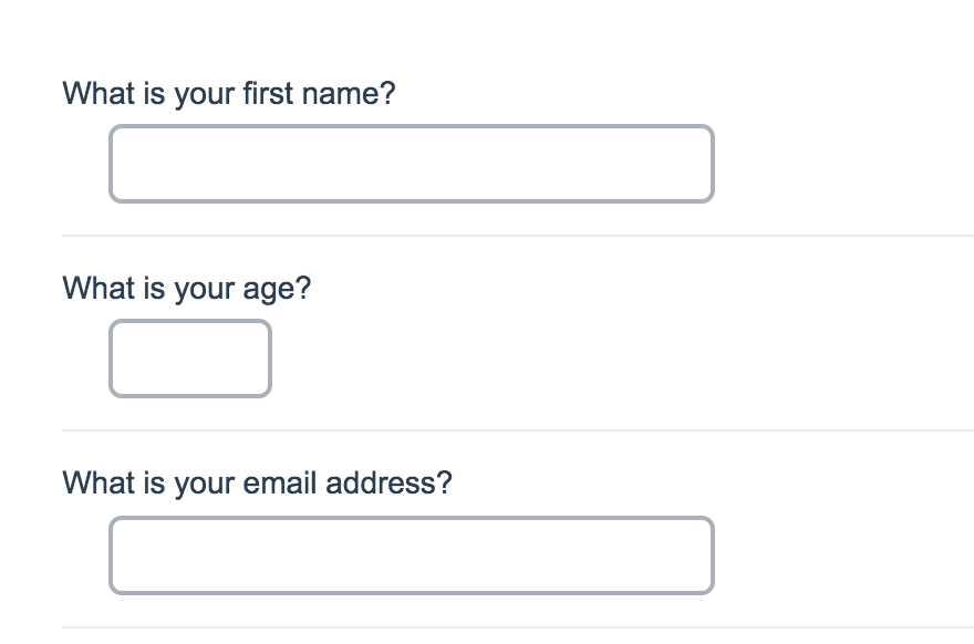
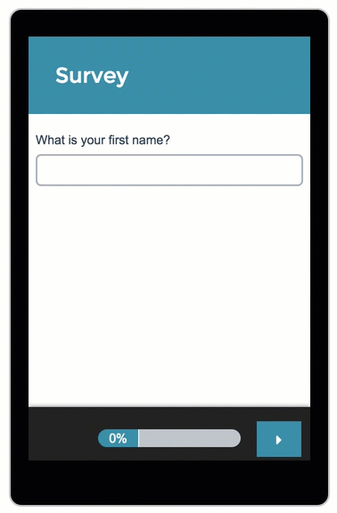
Single Text Fields (Textbox, Essay, Number, Percent, Email, etc.)
On a desktop and most laptops, the text fields look like so.
When optimized for mobile devices the Number question type looks very similar but will show one field at a time to prevent the need for scrolling on smaller screens. You can turn off this one-at-a-time interaction if you wish.
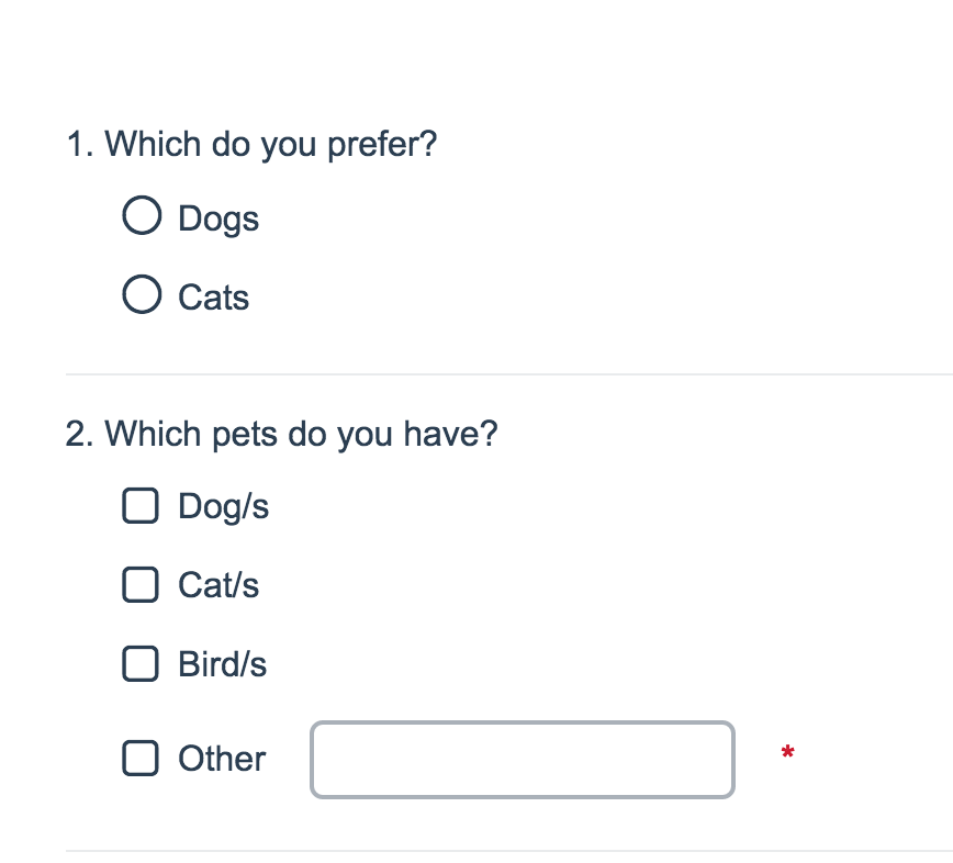
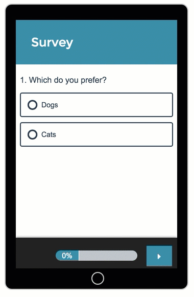
Single-Select Question (e.g. Radio Buttons, Rating, NPS®, Dropdown Menu)
On a desktop and most laptops, single-select question looks like so.
When optimized for mobile devices single-select questions look very similar but with larger targets as mobile respondents will be using their finger to select answers.
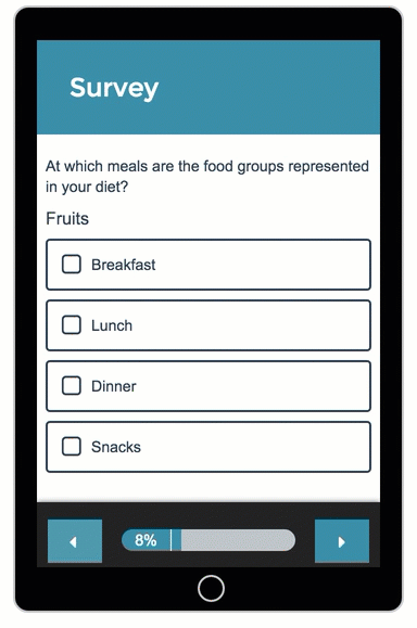
Grid Questions (Including, Textbox Grid, Radio Button Grid, Checkbox Grid, and Dropdown Menu Grid, as well as, the Star Rating Grid, and Custom Tables)
On a desktop and most laptops, the grid questions look like so.
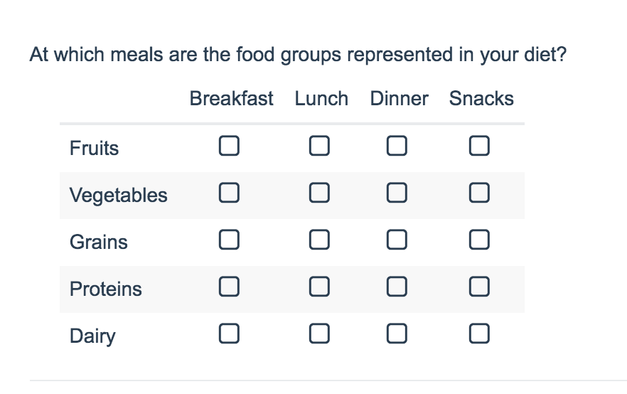
Grid questions will be displayed one grid row per page. This will reduce horizontal scrolling trouble as well as problems survey respondents typically experience trying to select the correct option.
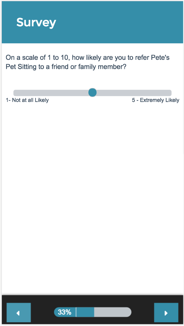
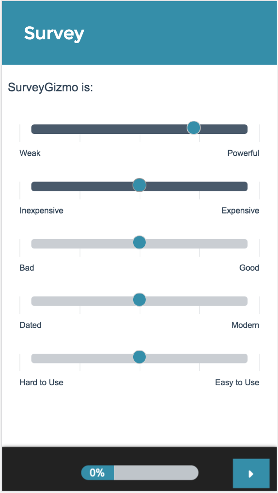
Slider
On a desktop and most laptops, the Slider question type looks like so.
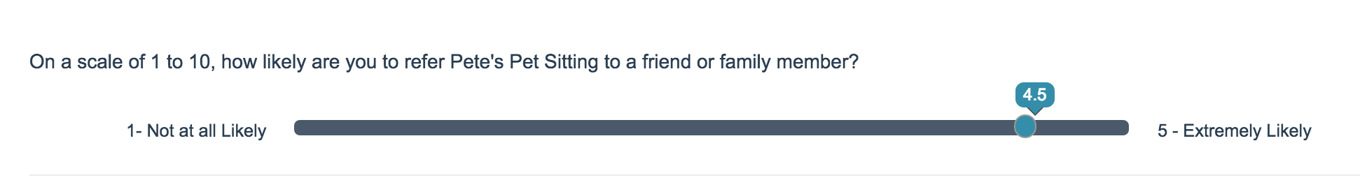
The right and left labels on Slider questions are displayed below the slider itself to allow more room for this text. You'll still want to ensure that your text is short enough to display well on mobile.
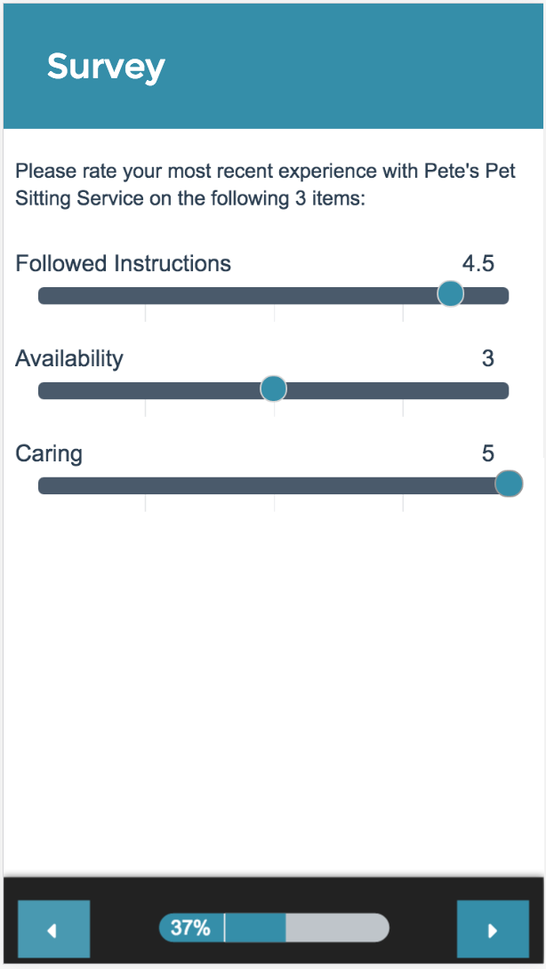
Slider List
On a desktop and most laptops, the Slider List question type looks like so.
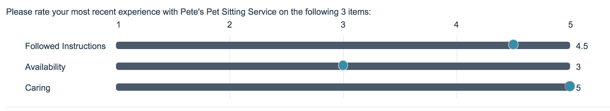
The row headers for each item in your Slider List will display above the slider itself to allow more room for this text. You'll still want to ensure that your text is short enough to display well on mobile.
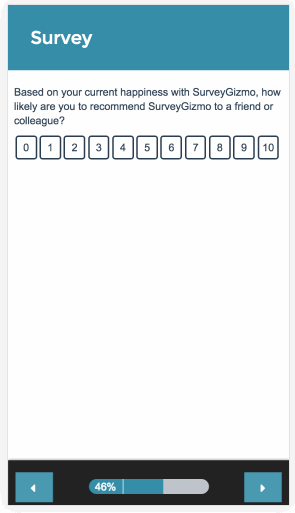
Net Promoter Score
On a desktop and most laptops, the Net Promoter Score question type looks like so.

When optimized for mobile devices the Net Promoter Score question type looks very similar but with larger targets as mobile respondents will be using their finger to select answers.
Single-select questions, like the Net Promoter Score question, will automatically advance after an option is selected. You can turn off this one-at-a-time interaction if you wish.
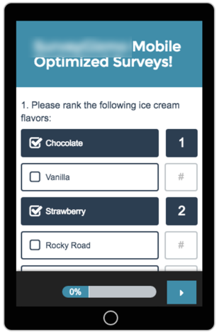
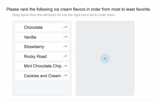
Drag & Drop Ranking
On a desktop and most laptops, the Drag & Drop Ranking question type looks like so.
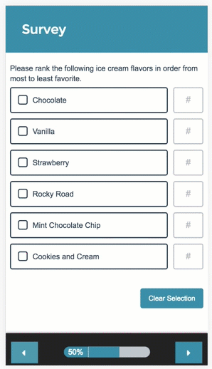
When optimized for mobile devices the Drag & Drop Ranking question type works a little differently as dragging and dropping on mobile devices is difficult. Instead, respondents will need to click the options in order of their preference.
Ranking Grid
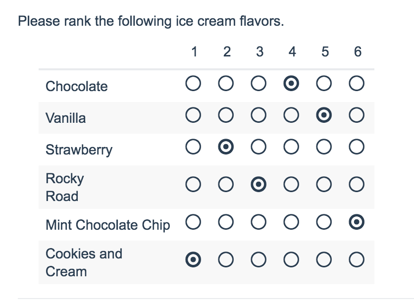
When optimized for mobile devices the Ranking Grid question type works a little differently as the small targets in grids are difficult to interact with on mobile devices. Instead, respondents will need to click the options in order of their preference.
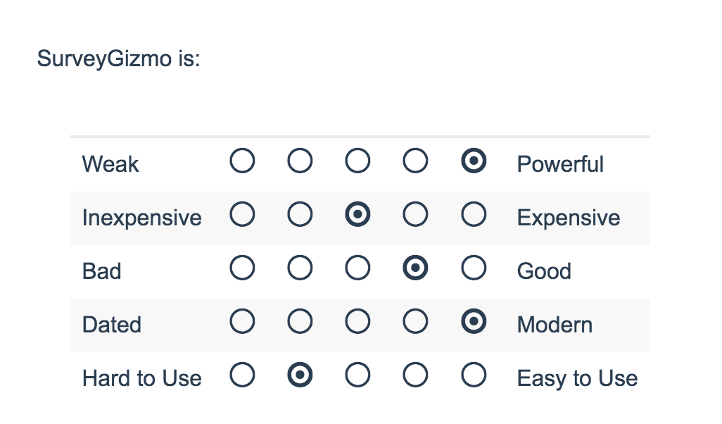
Semantic Differential
The Semantic Differential questions are converted to slider questions. It's important to note that Semantic Differentials are not fully compatible with mobile, as column headings will not appear. See screenshots below.
File Upload
The File Upload question has limited functionality on iOS devices. However, it will allow respondents to upload images/videos saved to the device. If you access a File Upload question using iOS, you'll see the following:

Depending on the Android device, you can also access other file types. Please test this on intended devices before deploying as the fragmentation of Android software means that not all features are available on all devices.
Here is an example of what options you'll see using Android:

Supported Devices
We support Android and iOS devices including Smart Phones and Tablets. We also test the survey experience on some additional devices including the Windows Nokia Lumina, the Amazon Fire tablet and the Blackberry Playbook tablet.
Net Promoter, Net Promoter System, Net Promoter Score, NPS and the NPS-related emoticons are registered trademarks of Bain & Company, Inc., Fred Reichheld and Satmetrix Systems, Inc.
— Mike.cordeiro on 03/11/2020
@Operations: Thanks so much for your question!
To change the language during survey taking I suggest adding the toolbar to your survey. This will allow respondents to take their survey in the language of their choosing and change it dynamically during survey taking. Follow the below link for more information on how to set this up:
https://help.surveygizmo.com/help/survey-toolbar
I hope this helps clarify!
Mike
Documentation Specialist
SurveyGizmo
— Operations on 03/11/2020
Hello, is there a way to toggle language on a mobile device? I am setting up a survey set in both French and English but cannot seem to find how to change language to French on my mobile phone.
Admin
— Dave Domagalski on 04/26/2019
@Bruce: Thank you for your question!
It's a bit difficult to advise specifically for your survey, but SurveyGizmo does allow you to target only mobile surveys via CSS.
This article should be a good place to start:
https://help.surveygizmo.com/help/mobile-themes#using-media-queries-for-mobile-customizations
Additionally, the below article may be a good reference point for all things font-related:
https://help.surveygizmo.com/help/change-font-font-size
I hope this helps!
David
Technical Writer
SurveyGizmo Customer Experience
— Bruce on 04/26/2019
I am finding the font size on Desktop to be too small and the font on the phone to be too large. Is there a way to change font size depending on device? Using custom html/css, maybe?
Admin
— Dave Domagalski on 04/24/2018
@UNOPS: Thank you for exploring SurveyGizmo documentation content!
Yes, surveys are automatically optimized for tablets, including iPads.
I hope this helps clarify!
David
Documentation Specialist
SurveyGizmo Customer Experience
— UNOPS on 04/24/2018
Could you please let me know if the surveys are also optimized for tablet such as Ipad?
Admin
— Dave Domagalski on 12/12/2016
@Owain: Thank you for your question!
The best option here is likely to utilize SurveyGizmo's Video Player (where you can specify the video size as a percentage) This will result in the video automatically resizing based on the screen size:
https://help.surveygizmo.com/help/embed-video#step-2-adding-a-video-player-to-your-survey
If you prefer to embed an external video player i.e. YouTube, you can adjust the width property within the embed code to be a percentage, and can then adjust the video height to something that best suits your needs. For example:
I hope this helps!
David
Documentation Specialist/Survey Explorer
SurveyGizmo Customer Experience
— Owain.tudor on 12/12/2016
Is it possible to resize a video depending on the device? The video I have embedded looks fine on a pc but on a mobile I can only see a qurter of the video before I hit play and that looks awful.
Admin
— Bri Hillmer on 03/07/2016
@User: Here is the tutorial I promised!
http://help.surveygizmo.com/help/article/link/prevent-mobile-responses
Let me know if you have questions!
Bri
Documentation Coordinator/Survey Sorceress
SurveyGizmo Customer Support
Admin
— Bri Hillmer on 03/07/2016
@User: That's a great question! You can do this pretty easily by using the ismobile rule that we have available in our logic builder. Basically, you could set up an initial page in your survey with text telling mobile users that they should return when they are on a desktop. Then using the ismobile rule you can only display this page to mobile users. I would be happy to write up a tutorial with specific steps to do this. I'll reach out just as soon as I have it!
Bri
Documentation Coordinator/Survey Sorceress
SurveyGizmo Customer Support
— UX on 03/07/2016
I don't want participants to be able to answer a survey from a mobile device, only from desktop. Is it possible? Thank you!
Admin
— Dave Domagalski on 06/26/2015
@Jlr: Thank you for exploring SurveyGizmo documentation and for your suggestion! A drag & drop question would be converted to a mobile friendly version if the survey has mobile optimization turned on. I will be opening a ticket with you to see if we can sort this out! You should see an email soon.
David Domagalski
Survey Explorer
SurveyGizmo Customer Support
— Jlr on 06/26/2015
It would be helpful to have a troubleshooting guide for issues with load time on an iPhone. We were using a drag and drop question, but it wouldn't work. Is there an issue with list length?